Redesigning the City of Toronto's recreational facility booking system
City of Toronto
Platform
Responsive Website
Timeline
Feb 2024 - Mar 2024
Role
Product Designer
Team
Solo Project, Academic

Overview
Toronto's facility booking system was built for a different era — one where most users sat at a desktop and had patience for multi-step forms. This project reimagined the entire experience from the ground up, starting with mobile, to make recreational services genuinely accessible to every Toronto resident.
goal
Make it possible for any Toronto resident to find, book, and confirm a recreational facility in under 5 minutes on their phone — without needing to know where to look.

The Problem
The system wasn't broken in one obvious way. It was slightly wrong in every direction at once.
Toronto's facility booking system worked against the people using it. Navigation was buried and inconsistent, the booking flow required too many steps to reach a simple outcome, and none of it worked properly on mobile — the device most people actually use to search for city services on the go. The system wasn't broken in one obvious way. It was slightly wrong in every direction at once.

Mobile-First Approach
Optimize the website for mobile with responsive design to ensure smooth functionality and ease of use on all screen sizes.

Simplified Menu
Refine site structure and navigation with user-informed clear menus and labels.

Streamlined Process
Simplify the booking process with fewer steps, clear availability display, and smart forms for quick completion.
Problem statement
How might we make booking a city facility feel as simple as booking anything else online?"
Secondary Research
The frustration was documented. We just needed to listen.
Toronto's booking system wasn't a new problem — it had been publicly criticized for years. BlogTO reported that the Parks, Forestry and Recreation department was still running a system described as outdated and in need of reorganization, with users citing non-intuitive design and confusing workflows. The Toronto Star documented that the booking software was so limited in functionality that staff were manually managing wait lists — a gap that directly affected residents trying to access programs.
BlogTo, City of Toronto website still a mess years after it was supposed to be redone
TORONTO STAR, Frustrated at the sign-up for city swimming lessons? A fix for ‘clunky’ website years away, say staff
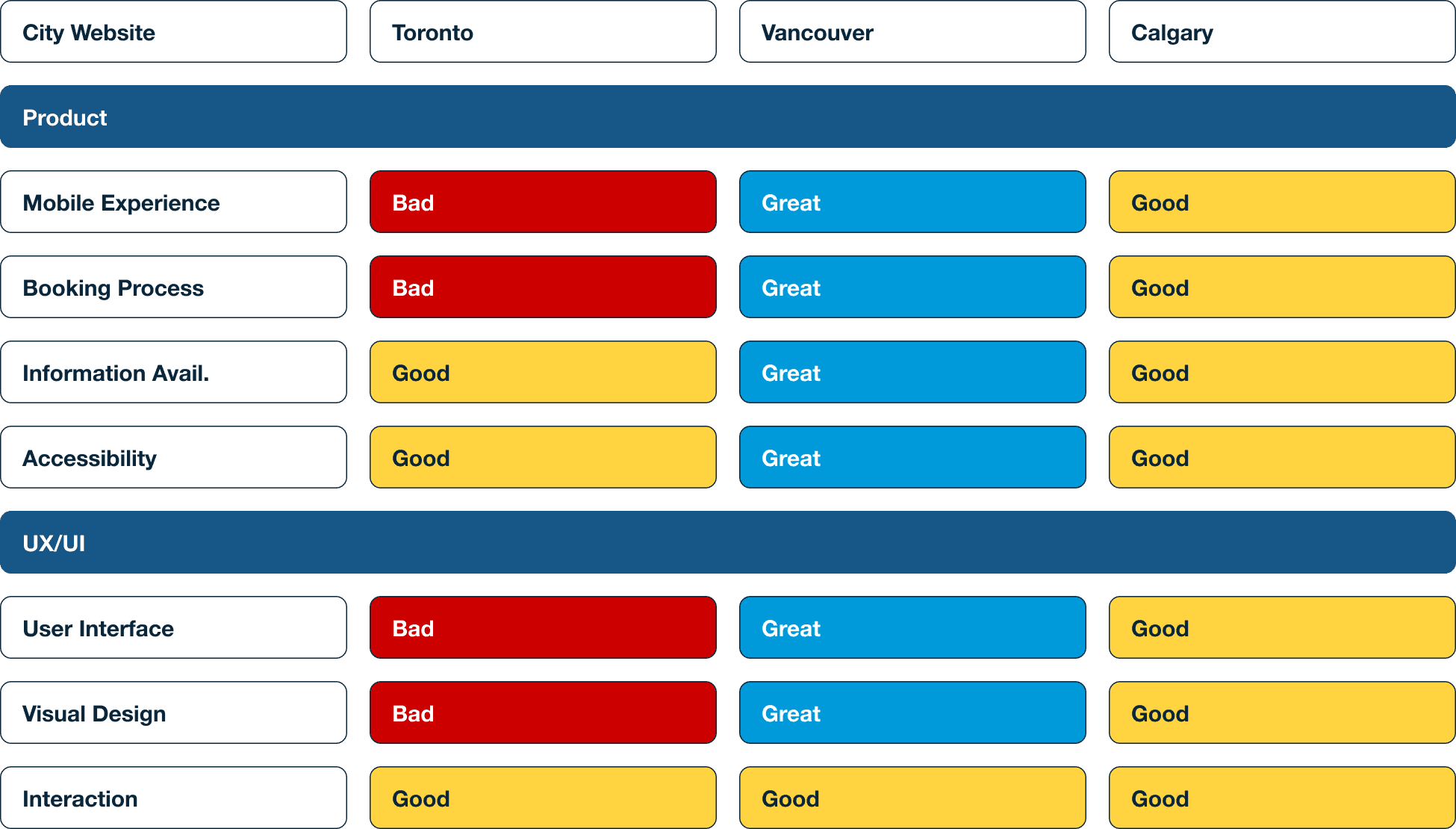
Comparative Analysis
Compare with other website from other cities in Canada
To understand how Toronto compared, I benchmarked against Vancouver and Calgary's city websites across five dimensions: mobile experience, booking process, information availability, accessibility, and UI quality. Toronto rated poorly on mobile experience, booking process, and visual design — areas where both Vancouver and Calgary had made meaningful improvements. This confirmed that the problems weren't unique to Toronto's content — they were systemic design failures.
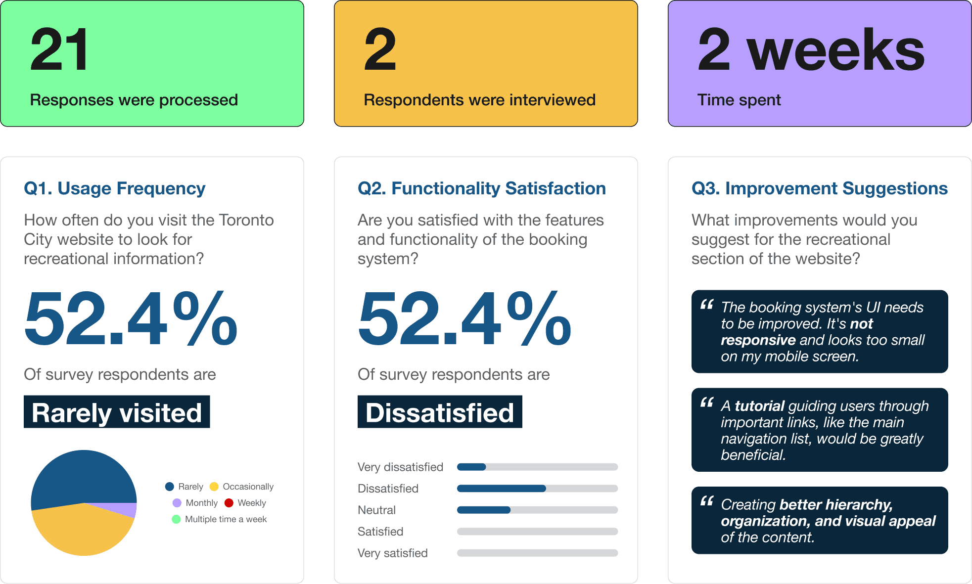
Survey
52.4% of survey respondents are dissatisfied with the booking system.
I ran a 12-question survey that received 21 responses and conducted two in-depth interviews over two weeks. The survey revealed that the majority of users rarely visited the site for recreational information — not because they weren't interested in city programs, but because the experience made it too difficult to find what they needed.
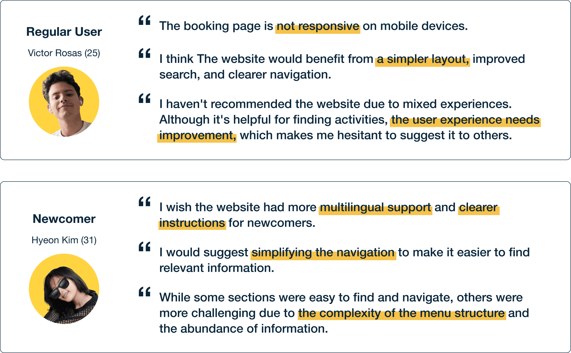
In-depth Interview
Conducted two in-depth interviews
I deliberately chose these two users because they represented different relationships to the system — one who had tried to use it repeatedly and given up, one who was encountering it for the first time. Both hit the same walls.
Ideate
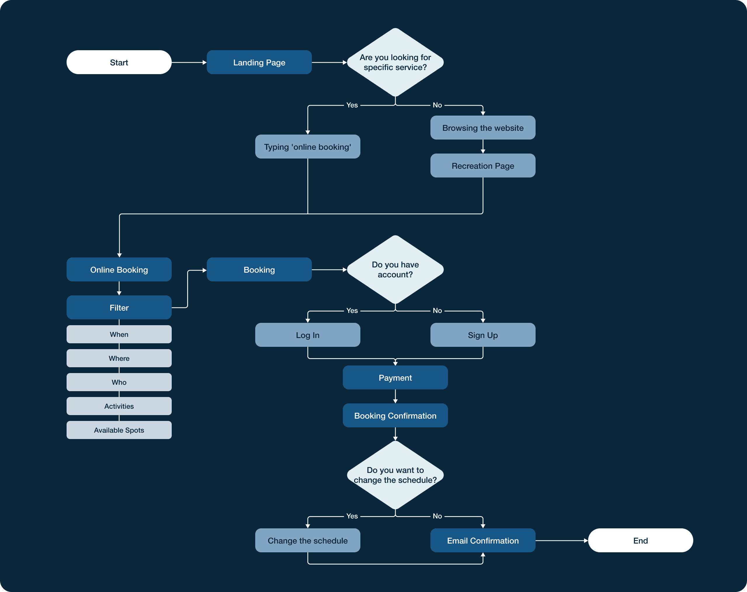
User flow
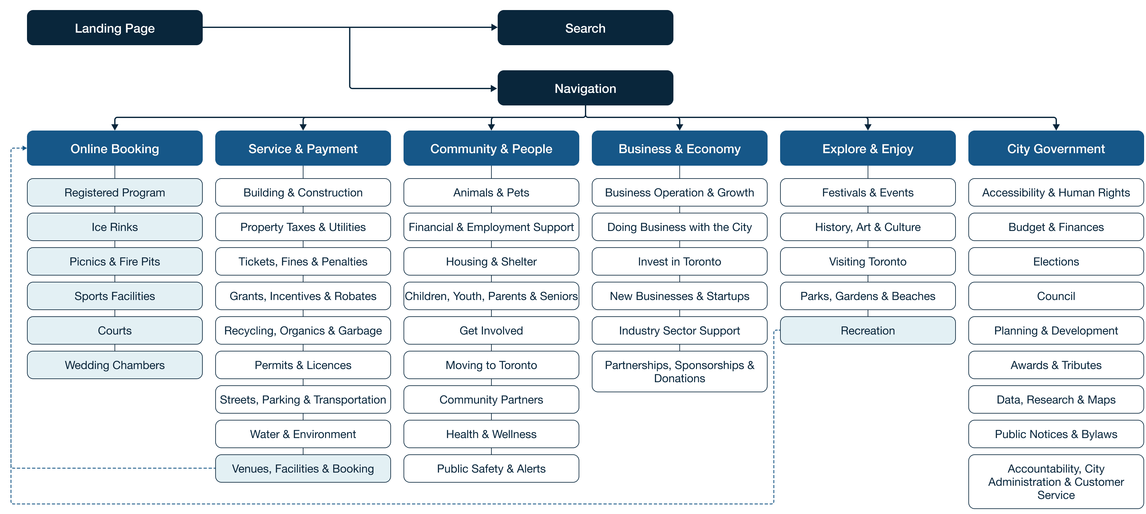
The user flow maps the end-to-end path from landing page to booking confirmation. Mapping this flow early helped identify where the original experience broke down: users were being asked to navigate three or four levels deep before they could even see what was available to book.
Ideate
Informative Architecture
I restructured the navigation by promoting Online Booking to a top-level item in the main nav — reducing the path from homepage to booking from multiple clicks to one.
prototype
Wireframes
I started with a mobile-first approach, sketching key screens by hand before moving to detailed wireframes in Figma. The priority was making the booking flow work on a small screen first — filters, date and time selection, reservation form, and checkout — then scaling up to desktop. This constraint forced cleaner hierarchy decisions than designing for desktop first would have allowed.
Toronto Homepage
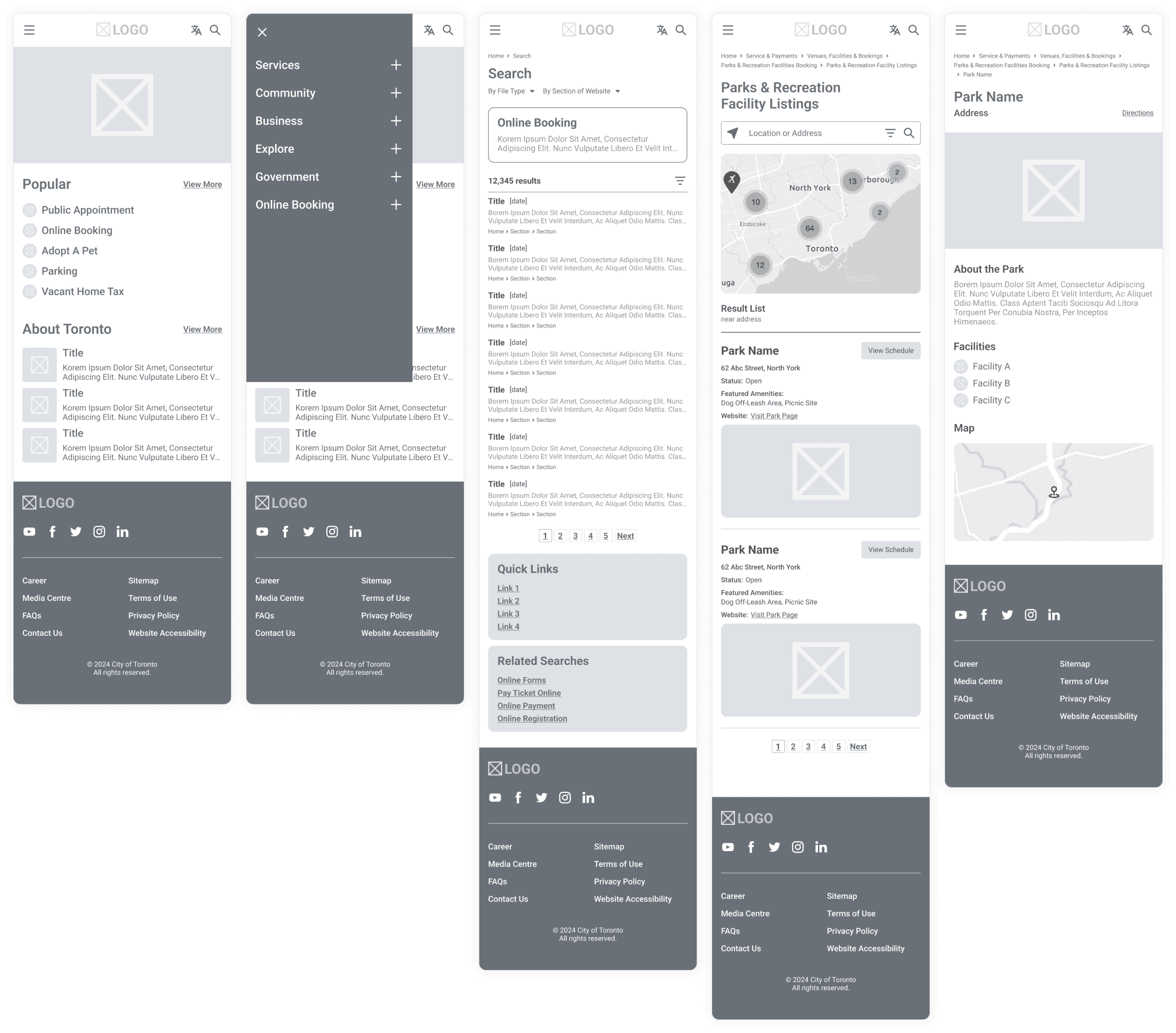
Online Booking
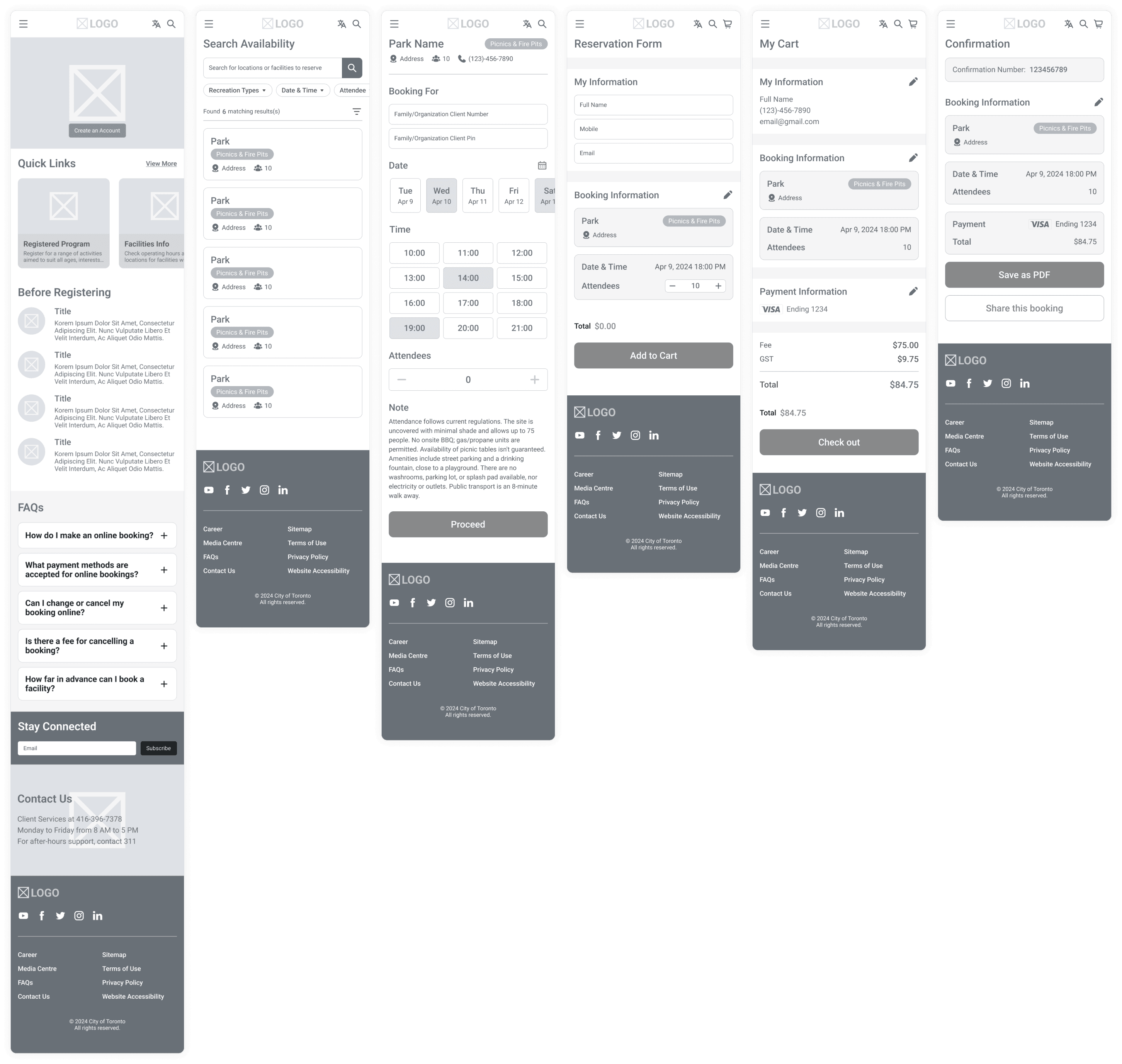
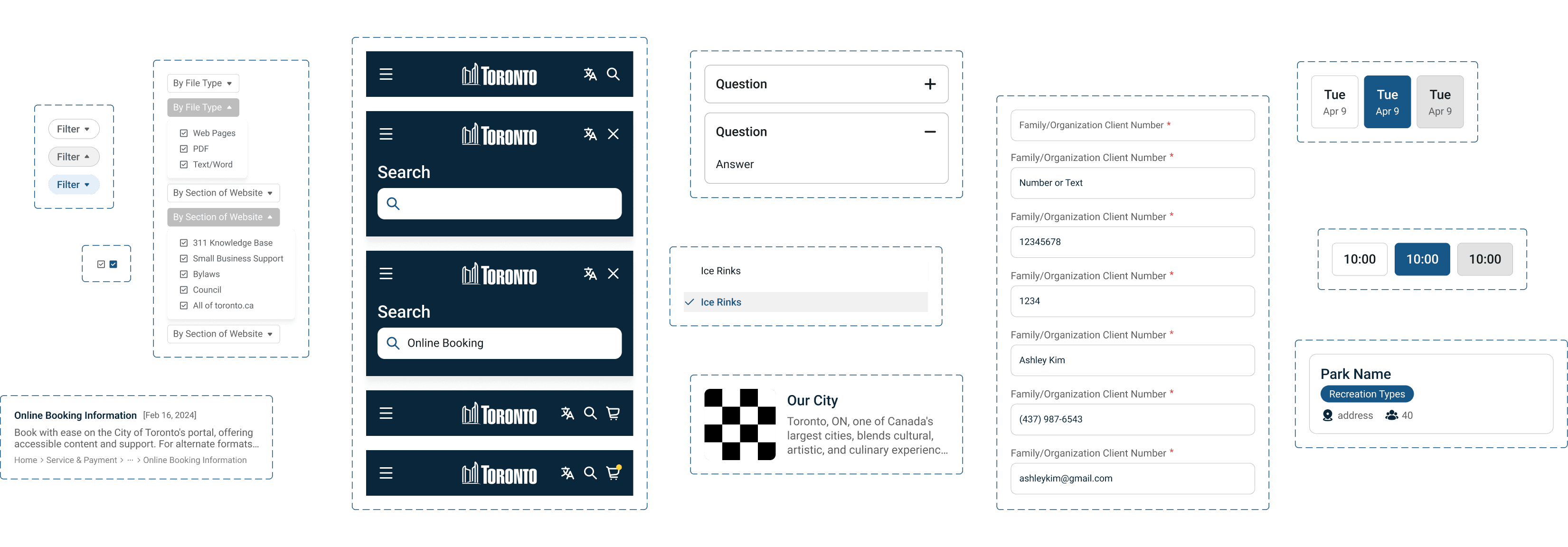
UI Componenets
User testing
I tested the prototype with two users and got specific, actionable feedback that led to two direct design changes.
Design Iteration 01
Slot Visibility
Available time slots were hard to identify during the booking process. Users were scanning the calendar view without a clear sense of what was open versus taken. The redesign introduced a clearer visual distinction between available and unavailable slots, making availability readable at a glance without requiring users to tap each time to check.

Design Iteration 02
CTA Clarity
Users were confused by the final CTA on the confirmation screen. "Share my booking" didn't communicate what would happen next. Changing it to "Send to My Email" removed the ambiguity and matched the mental model users already had for how booking confirmations work.

Presentation deck
The Final Product
The final design delivered three core improvements across desktop and mobile.

Mobile First Design
A fully responsive booking experience designed for phone-first use — from browsing available facilities to completing a reservation without ever needing to switch to desktop.


Simplified Menu
Online Booking added as a primary navigation item, giving users a direct path to the most-used function from any page on the site. No more hunting through service categories.
Streamlined Process
A redesigned booking flow with search and filters upfront, clear availability display, a streamlined reservation form, and a checkout process that ends with email confirmation — reducing unnecessary steps at every stage.

outcome
Restructuring the navigation and moving Online Booking to the main nav was the single highest-impact change — participants reached the booking flow directly from the homepage without prompting.
Eye-tracking
Eye-tracking data from Clueify validated the navigation restructure. Attention landed naturally on Online Booking and Quick Links, the two areas that mattered most, without users needing to search.

Reflection
What I Learned
I started this project as a Toronto resident who had personally struggled with the booking system — which meant my biggest design challenge wasn't the interface, it was my own bias. I had to actively work against my assumptions by running research that was designed to find out where I was wrong, not confirm what I already thought. Designing for a government service also pushed me toward clarity over creativity — every decision had to work for a regular user, a newcomer, and someone on a low-end mobile device. That constraint made me a more rigorous designer.
Bias Awareness
During the design process, I was careful to set aside my own experiences as a user and focus on the diverse needs of all users. This meant making decisions that weren’t just based on what I liked, but what would be best for everyone using the website, keeping a clear boundary between my personal views and my professional duties.
Mobile-First Thinking
The aim was to create a website that automatically adjusts to fit the screen it's viewed on, whether that's a phone, tablet, or computer. I put in extra effort to ensure that every feature would be just as easy to use on a small phone screen as on a large desktop display, considering the different ways users might interact with the site.